Andy Warhol’s 1972 Sunset is a series of screenprints commissioned by architects Johnson & Burgee for the Hotel Marquette in Minneapolis. Using just three screens to generate an extraordinary 632 unique colour variants, Warhol transformed a simple motif into an exploration of colour, mood and repetition.
Andy Warhol created the Sunset series in 1972 for Johnson & Burgee’s Hotel Marquette in Minneapolis
Commissioned specifically for the newly renovated Hotel Marquette, Johnson & Burgee sought art that could define the building’s atmosphere. Unlike ad hoc hotel décor, Sunset was conceived as an integrated visual system: a repeating motif calibrated to shift as guests moved through the site, echoing the daily cycle of light and dusk across Minneapolis.
The Sunset series comprises 632 unique screenprints

Rather than a conventional edition with numbered multiples, Sunset is a matrix of 632 singular colourways built on the same motif. The scale let Warhol explore how micro-changes in colour alter perception and mood. It also showcased his factory mindset: a controlled production line that generated variation without sacrificing the image’s brand-like consistency. Sunset is among Warhol’s most ambitious print projects, the artist using the series as a research laboratory for colour behaviour in print.
472 Sunset prints were installed across the Hotel Marquette interiors
The majority of the prints were installed in the Hotel Marquette, transforming guest rooms, lobbies and corridors into different stages of the day. This environmental approach is central to the work’s identity, as Sunset was designed as an immersive chromatic scheme for hospitality architecture in the early 1970s.
160 Sunset prints were assembled into 40 unique portfolios of four

Beyond the hotel installation, Warhol’s studio curated 40 portfolios, each containing four different colourways. These sets distilled the project’s range of warm, cool, high-contrast, and soft-gradient examples into compact portfolios suitable for galleries and collectors. Today, complete Sunset portfolios are considered rare, sought after for presenting Warhol’s colour thesis as a coherent mini-exhibition that still reflects the series’ architectural origins.
Warhol used only three screens to produce the series

Warhol used only three screens: one screen laid down the horizontal bands that read as sky and horizon; a second printed the circular sun; a third was a single-colour dot screen that introduced optical grain across broad fields of ink. With just these three plates, Warhol engineered remarkable breadth. By restricting his tools, Warhol ensured the image stayed instantly recognisable while allowing colour decisions to carry the expressive load.
Then "flatness" of the sun preserves Pop Art aesthetics

Printed on smooth woven paper, the single-colour circle representing the sun preserves a carefully engineered “flatness” designed to have colour read as a printed surface rather than a painterly gesture. That decision aligns squarely with Pop Art’s embrace of mechanical processes and commercial print aesthetics. By favouring a controlled dot matrix over expressive mark-making, Sunset embraces Pop’s core ethos of serial, reproducible imagery.
Variation came from inking combinations and deliberately varied registration

Warhol’s team manipulated colour not just by swapping inks but by adjusting registration (the exact alignment between screens). Slight offsets thicken the sun’s edge, reveal haloes, or create thin horizons where bands meet. Ink loads ranged from translucent washes to saturated slabs, so identical palettes could feel airy or thunderous. These production variables are integral to Sunset’s dialogue where variation is intentional.
Sunset is an example of colour serialisation in contemporary Pop Art

Serialisation (repeating a fixed image across controlled differences) is a Pop Art classic. Sunset pushes that logic from celebrity iconography to natural imagery. By using the same image but producing hundreds of weather systems, Sunset links Pop to colour-field and Op Art concerns while retaining Warhol’s signature seriality.
The series marks a departure from Warhol’s celebrity imagery toward pure colour exploration

Where Warhol’s Marilyns and Maos hinge on fame and mediation, Sunset strips the subject back to basic natural beauty, refocusing attention on perception rather than on persona. For curators, the series balances Warhol’s oeuvre, demonstrating how his printmaking can be contemplative, environmental and lyrical without sacrificing Pop clarity.
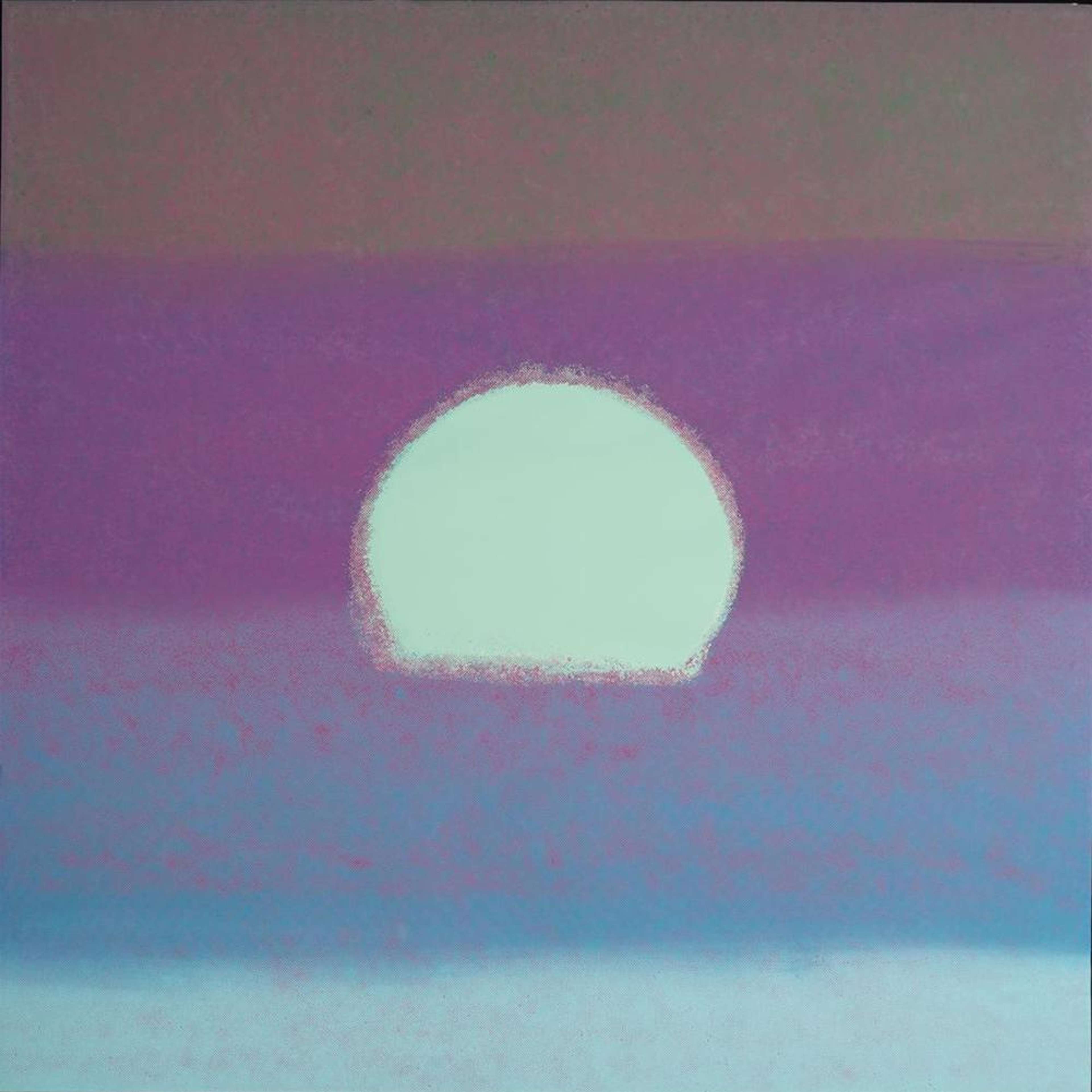
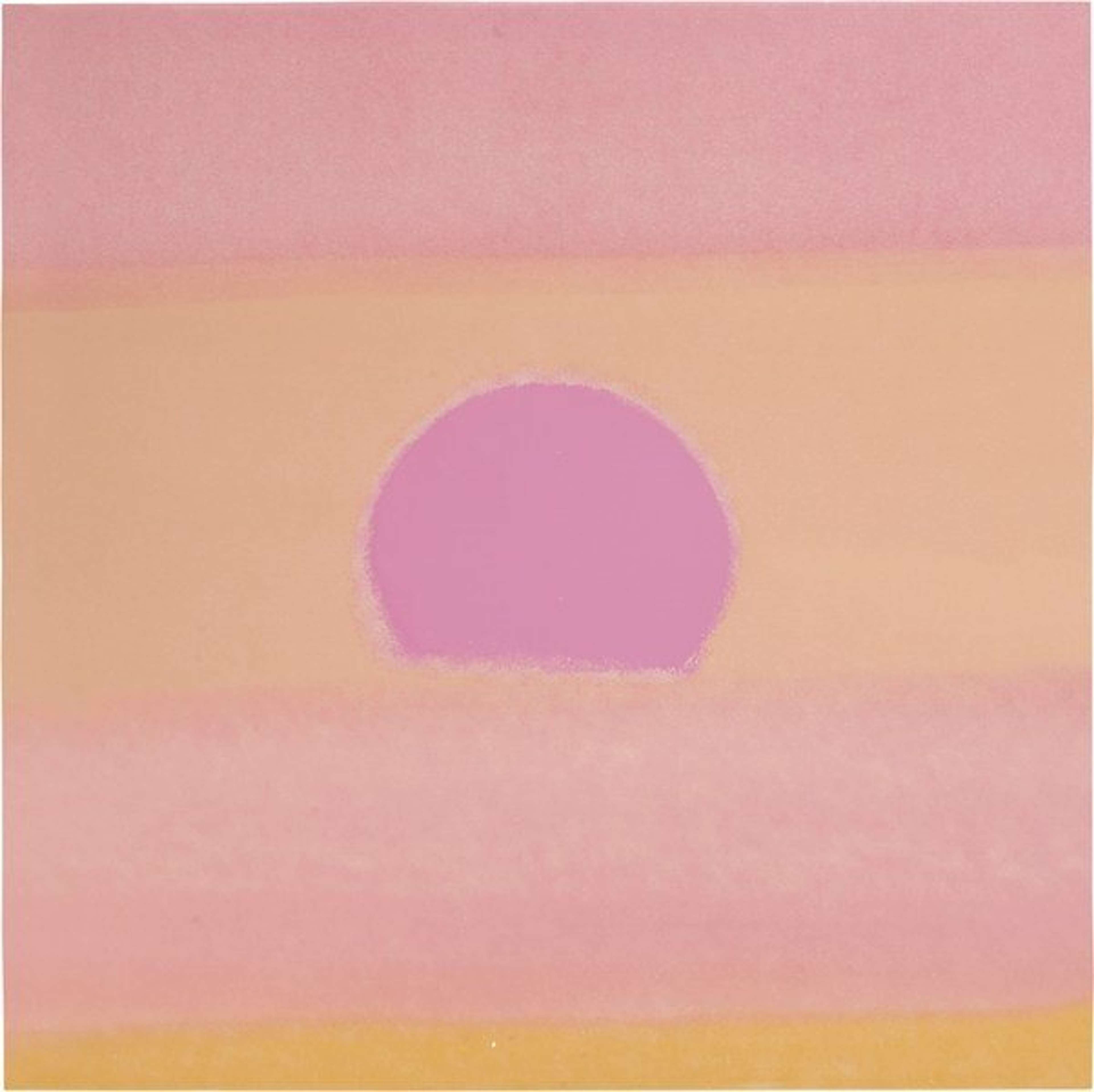
Sunset's palette ranges from familiar red–orange harmonies to unexpected greens and blues

While many prints in the series stay within a natural sunset palette of deep reds, oranges and yellows, others such as Sunset FS II.85-88 embrace unexpected pairings: light turquoise, green and beige circling a bold yellow sun. The clash appears synthetic, the colours almost neon, showcasing how changing just three or four inks can transform the mood of the print from calm to electric.