Sunset
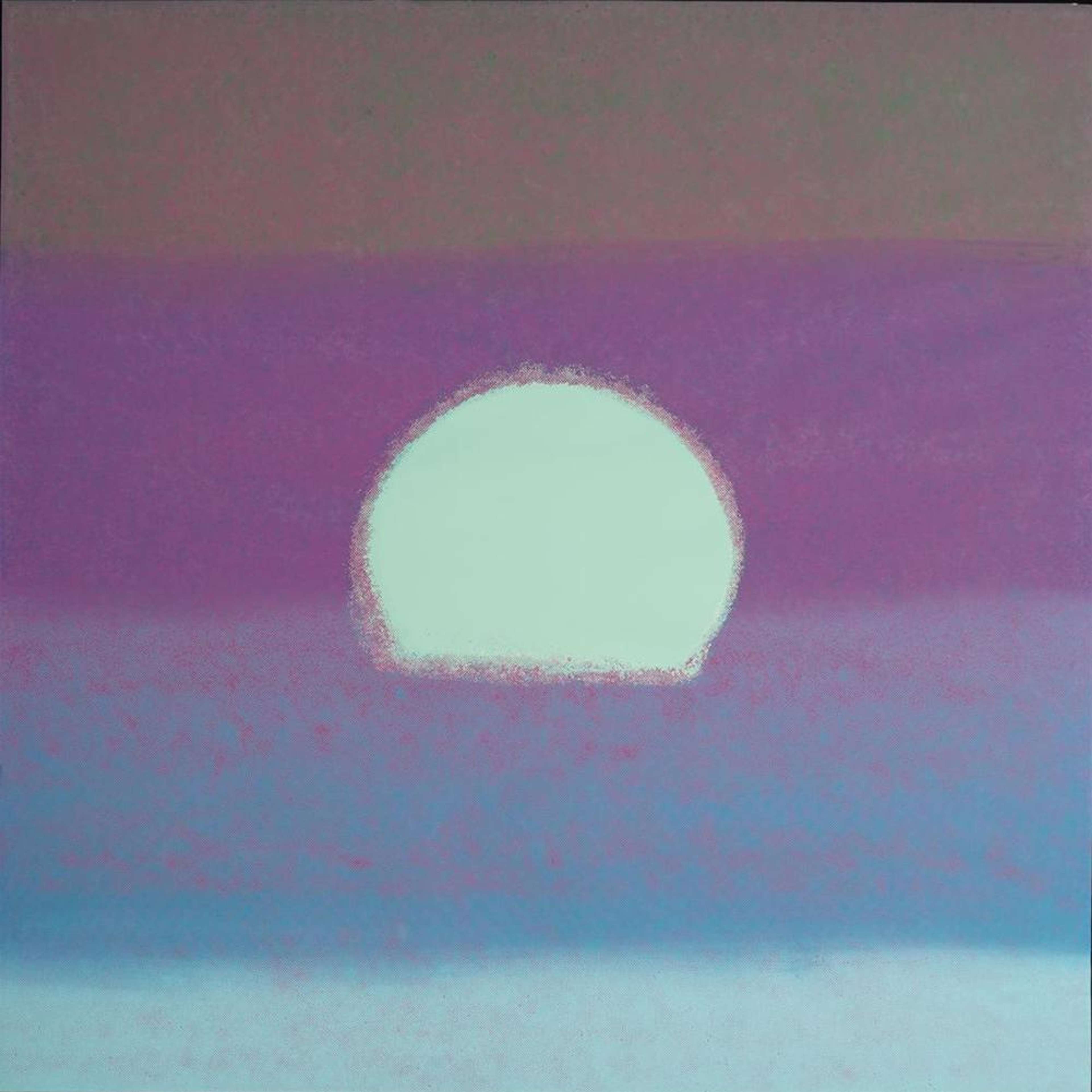
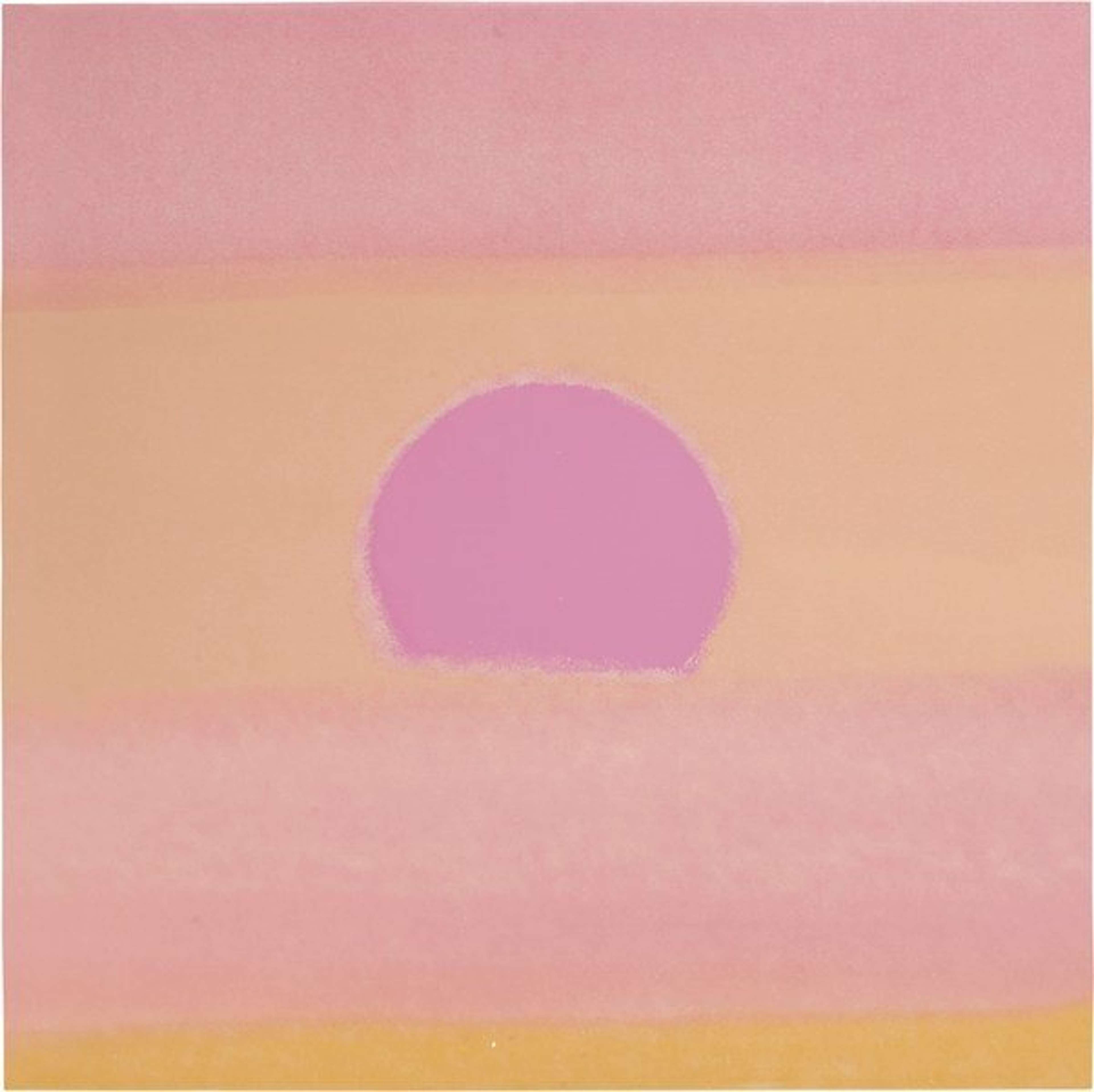
Epitomizing his prolific experimentation, Andy Warhol’s Sunset (1972) prints, commissioned by architects Johnson & Burgee for their new hotel in Minneapolis, contains 632 unique colour variants made from only three screens. Some 472 were installed in the hotel, while 160 were formed into 40 unique portfolios of four.
Andy Warhol Sunset For sale
Sunset Value (5 Years)
Works from the Sunset series by Andy Warhol have a strong market value presence, with 78 auction appearances. Top performing works have achieved standout auction results, with peak hammer prices of £166096. Over the past 12 months, average values across the series have ranged from £33815 to £166096. The series shows an average annual growth rate of 14.37%.
Sunset Market value
Auction Results
| Artwork | Auction Date | Auction House | Return to Seller | Hammer Price | Buyer Paid |
|---|---|---|---|---|---|
 Sunset Andy Warhol Signed Print | 25 Mar 2026 | Sotheby's London | £85,000 | £100,000 | £140,000 |
Sell Your Art
with Us
with Us
Join Our Network of Collectors. Buy, Sell and Track Demand
Meaning & Analysis
Commissioned by architects Johnson and Burgee for their new Minneapolis hotel in 1972, Warhol’s Sunset series is comprised of 142 colour variations. These themes pervaded much of Warhol’s work, as he sought to comment on American capitalism whist creating some of the most iconic and enduring images in the history of Pop Art. However, the Sunset series, which is revered as one of the most expressive portfolios of Warhol’s career, strays away from the territory of celebrity culture.
Warhol’s Sunset series was produced in 1972, commissioned by renowned architects Johnson & Burgee to be installed in their newly renovated Hotel Marquette in Minneapolis, Minnesota. The series consisted of 472 unique colour variations for installation in the hotel, in addition to 160 prints that were assembled in to 40 unique portfolios.
Astonishingly, all of the Sunset prints were produced using only three screen prints: one to apply the background strips of colour, one for the sun and one with a single-colour dot pattern to provide texture. Warhol then inked the screens in a range of colour combinations and printed them with varying registration to create a total of 632 unique screen prints on smooth woven paper.
With this technique the portfolio became widely regarded as the archetypal example of colour serialisation in contemporary art. This allowed Warhol to explore the range of graphic possibilities in a single image, manipulating colour and creating contrasting effects with each repetition. Individual prints in the series therefore evoke varying sensations and emotions based on their colour spectrum.
For example, Sunset (Red) depicts a harmonious mixture of red hues with the dark red sun as the focal point, becoming one of Warhol’s most desirable in the series due to its simplicity. By contrast, in Sunset 85 is perhaps a less conventional sunset with shades of light turquoise, green and beige blending together to create the horizon around the bold yellow sun.


