Broome
Street Series
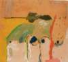
Helen Frankenthaler’s Broome Street Series (1987) comprises six aquatint and drypoint prints that explore layered colour, texture, and gestural line. Using multiple plates, she evoked shifting urban moods through translucent overlays and precise mark-making, translating her painterly language into a richly atmospheric and technically ambitious body of print work.
Helen Frankenthaler Broome Street Series For sale


Broome Street Series Value (5 Years)
With £27957 in the past 12 months, Helen Frankenthaler's Broome Street Series series is one of the most actively traded in the market. Prices have varied significantly – from £1339 to £15124 – driven by fluctuations in factors like condition, provenance, and market timing. Over the past 12 months, the average selling price was £9319, with an average annual growth rate of 6.77% across the series.
Broome Street Series Market value
Auction Results
| Artwork | Auction Date | Auction House | Return to Seller | Hammer Price | Buyer Paid |
|---|---|---|---|---|---|
 Sunshine After Rain Helen Frankenthaler Signed Print | 15 Apr 2026 | Sotheby's New York | £8,075 | £9,500 | £13,000 |
 Midnight Helen Frankenthaler Signed Print | 23 Oct 2025 | Sotheby's New York | £8,075 | £9,500 | £13,500 |
 Broome Street At Night Helen Frankenthaler Signed Print | 27 Feb 2025 | Bonhams Los Angeles | £4,675 | £5,500 | £7,000 |
 Spring Veil Helen Frankenthaler Signed Print | 4 May 2024 | Grogan & Company | £3,400 | £4,000 | £5,000 |
 Soho Dreams Helen Frankenthaler Signed Print | 24 Oct 2023 | Phillips New York | £4,675 | £5,500 | £8,000 |
Sell Your Art
with Us
with Us
Join Our Network of Collectors. Buy, Sell and Track Demand
Meaning & Analysis
The Broome Street Series serves as a late-career culmination of Helen Frankenthaler’s persistent innovations in both painting and printmaking. Produced using a sophisticated matrix of aquatint, drypoint, and multi-plate processes, the prints elude straightforward interpretation. Their immediacy suggests spontaneity, yet each composition is the product of meticulous calibration. Frankenthaler exploits the potential of overprinting and plate registration to create immersive fields of colour that appear to float above or sink into the paper's surface.
In Spring Veil, one of the more restrained works in the series, swirling green tones drift horizontally across the page in diluted acid washes. These painterly gestures are anchored by sharply incised drypoint lines - marks that lend tension and structure to the otherwise diaphanous forms. The horizontal plate edges echo the flow of pigment, enclosing it like a breath held in suspension.
With Soho Dreams, Frankenthaler deepens her chromatic complexity. Mauve is constructed through the careful overlay of pink and purple plates atop a brown aquatint ground, resulting in a translucent, alchemical surface. The effect is a veil of colour with the illusion of depth, evoking the layered, shifting textures of memory or dream. The superimposition of inks demonstrates Frankenthaler’s intimate understanding of how colour behaves under pressure and light, a skill developed from her soak-stain canvases of the 1960s and now translated to the print medium.
Sunshine After Rain functions as a temporal hinge, suggesting atmospheric transition. On the left, stormy swathes of brown and blue, vigorously wiped, evoke a downpour; to the right, faint streaks of yellow signal the return of light. A solitary horizontal stroke becomes a horizon line, grounding the otherwise vertical composition. This interplay of density and air, turbulence and calm, mirrors Frankenthaler’s ongoing investigation into spatial tension.
The final print, Tout à coup, is the most assertive in scale and intensity. Executed from two plates in dashing hues, it exemplifies Frankenthaler’s belief that a print should not merely replicate painting, but reinterpret it. Dense, swirling marks electrify a golden ground, transforming the print surface into a dynamic pictorial event. Remarkably, Tout à coup was composed in solitude; Frankenthaler cleared the workshop to work in privacy, underscoring the personal, almost performative, nature of its creation.
The six prints in this series are a testament to Frankenthaler’s ability to translate gesture into print without losing the immediacy of her painterly language. Her gestural handwriting - visible in the drypoint scratches, sugar-lift streaks, and ink washes - remains alive, activating the surface with a sense of movement and emotional urgency. Despite the physical limitations of the print matrix, she achieves a sense of painterly “breath,” reaffirming the print as a site of innovation rather than reproduction.