The Evolution of Bridget Riley's Colour Palettes

 New Day © Bridget Riley 1992
Bridget Riley
112 works
Bridget Riley, a British painter celebrated for her profound influence on the Optical Art (Op Art) movement, emerged in the 1960s with her distinct abstract patterns. These patterns, characterised by their ability to visually stimulate and sometimes even disorient the viewer, solidified her position as a key figure in the Op Art genre. Over the course of her career, Riley's exploration of visual language extended beyond the simple dichotomy of black and white. Her technique and transformative use of colour, shifting from sharp monochromes to energetic and dynamic palettes, is a masterclass on perception, emotion, and the sensory experience. This evolution not only highlights her adaptability as an artist but also her commitment to understanding and experimenting with the visual interplay of colour and form.
Bridget Riley’s Monochromatic Palette
Bridget Riley’s Monochromatic Palette
By using black and white, Riley crafted patterns that continuously interacted with its viewers' perception. Originally, it was Movement In Squares that showcased her genius, illustrating how simple colour palettes could create profound visual sensations. In these patterns, viewers experienced illusions of movement and depth, minus any distractions from the complexities of colour. Over time, Riley’s other black and white compositions like Shift and Untitled (Diagonal Curve) have proven themselves to be valuable passion assets considering their rank in Riley’s top auction prices.
Interestingly enough, Riley's deliberate monochrome phase can be seen as a period of constraint, which ultimately fueled her creativity. Perhaps her intention was to conceal her emotions in her early work, seeking a detachment where her art stood independently.
Her Fragment series makes it hard to believe that the pieces are unmoving, with zigzags that pulse rhythmically, circles that seem to dance, and spirals that conjure a mesmerising, almost dizzying sensation. Together, the works in this collection epitomise Riley’s knack for visual play, emphasising her understanding of colour and ability to create emotionally charged works without them.
It wasn't until 1967 that Riley began her colour-expanding journey, however her initial palette remained instrumental in her subsequent works. By immersing herself first in the world of black and white, she set the stage for richer, more colourful explorations, cementing her place in the Op Art scene.
Bridget Riley’s Transition Towards Colour
Bridget Riley’s Transition Towards Colour
As the 1960s progressed, Riley began to navigate away from her signature monochromatic patterns, signalling a new phase in her artistic practice. Initially, her foray into colour was marked by cautious exploration. Instead of a sudden burst of vibrant hues, she exhibited a subtle introduction of softer shades, hinting at her careful consideration and deep reflection on how to incorporate colour without losing the essence of her art.
nineteen greys
Before completely introducing a new palette, Riley’s Nineteen Grey’s presented itself as a waiting room. Where Fragment was solely black and white, she was now creating flashing, metallic traces of silver through her use of colour with tones that are obviously grey and white, but also an intriguing shade of blue, illustrated in Nineteen Greys A. This blending not only enriched her chromatic vocabulary but also signalled an evolving dialogue between contrasts and the subtle complexities in her new exploration of colour.
Bridget Riley’s Shift From Monochrome
Bridget Riley’s Shift From Monochrome
The late 1960s saw a transformation in Riley's works as she started weaving in subtle, muted tones, sometimes juxtaposed against her traditional black and white. These initial experiments can be perceived as a bridge between her past and her evolving future. Pieces from this period showcased her intrinsic understanding of colour's impact on perception, and how even slight shifts in hue could dramatically alter the viewer's experience.
Riley’s first work to part ways with her initial colour palette was Chant 2. This standout piece delivered closely spaced vertical stripes that oscillated between red and blue broken up by the white spaces between them, completely disrupting her former style. The colours blend with a rhythmic quality, creating illusions derived not from specific shapes or curves but directly from the colour interactions. While purple stands out prominently, subtle hints of yellow also radiate from the work. Even without a story or interactive element, the images give an illusion of motion, endlessly ebbing and flowing. This constant shift not only affects the images but also keeps the observer in a continuous state of engagement and change.
Bridget Riley’s Stripes
Bridget Riley’s Stripes
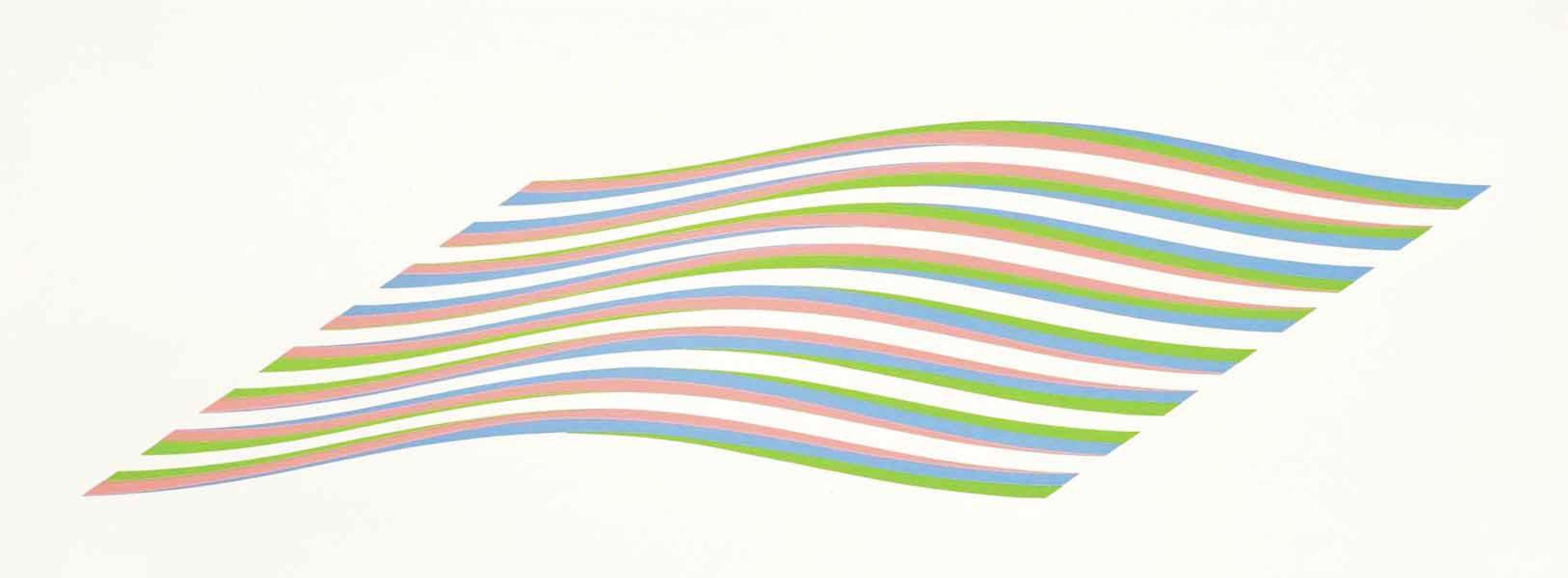
Riley's works often served as a playground where colour theory was not merely applied, but proactively explored and tested. She stretched the boundaries of colour perception, intertwining it with geometrical precision to produce vibrant visual effects. Her incorporation of the Bezold Effect, wherein a colour may appear altered due to its adjacent hue, demonstrates this pursuit. Riley’s Edge of Light– a piece adorned with vertical stripes, showcases a rhythmic and vibrating interaction of blue, green, and pink hues paired with her former signature black lines.
Firebird illustrates a sublime journey through a myriad of colourful stripes, but this time, with a twist. The work itself employs vertical, intertwining stripes of red, green, and blue, with white spaces we typically see in Riley’s work. However this particular work was composed in a way that guides the viewer’s eye in a way where they see a sort of twisting illusion taking place between the lines.
Bridget Riley’s Egyptian Palette
Bridget Riley’s Egyptian Palette
Throughout her career, Riley’s artistic journey allowed her to travel different parts of the world, collecting a sea of inspiration she would use along the way. Arguably, there was no place Riley visited that impacted her career and her colour palette more than Egypt. It was during her time there she developed what would go on to be called her “Egyptian Palette”, composed of a sample of the colours seen in ancient Egyptian hieroglyphs. Clearly visible in her Stripes collection, viewers may notice a turquoise resemblant shade of blue in works like RA 2, Achæan, and Serpentine. This inclusion of Egyptian-inspired hues not only enhanced the visual energy of her work but also speaks to how diverse cultures and historical artefacts can infuse an artist's work with more depth and discovery.
Bridget Riley’s Transition into Bold Colours and Shapes
Bridget Riley’s Transition into Bold Colours and Shapes
As Riley's palette expanded to embrace a broader spectrum of colour, her patterns also experienced an evolution. While her early works prominently featured squares and vertical lines, the advent of new aesthetic waves in her work introduced a bold exploration of colour blocking and more robust shapes, paralleling her adventurous dive into more confident, daring expressions.
In Lozenges, Riley’s use of colour continues to transform in her suite of compositions which are bold in both shape and colour. Compared to the softer shades she used earlier in her career, Riley incorporates more saturated tones of primary colours. Viewers have the advantage of watching this timeline of changes unravel through the works in this series.
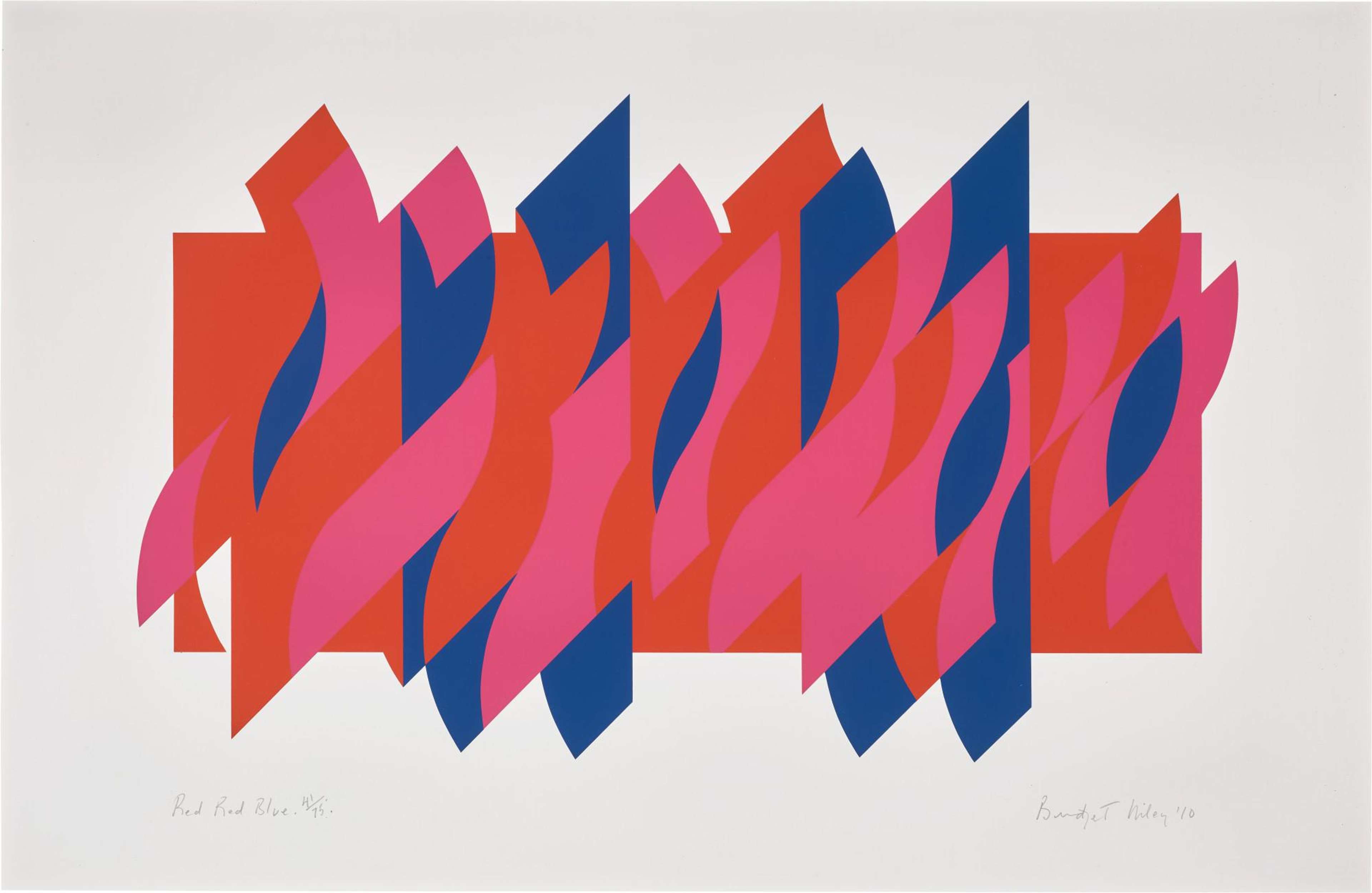
Riley’s 2003, Untitled (Evoe) presents quieter hues of a soft, pale yellow, and muted blues and greens. While she uses geometric shapes found within this suite, this work has fashioned the pieces together to blend more seamlessly like a puzzle. In contrast, her 2010 Red Red Blue exudes more vibrancy with much richer and louder shades of red, blue and pink dancing together in a more frenzied state, each with their own individual style that stands out amid the red rectangle in the background.
The progression from the tranquil, subdued tones in Untitled (Evoe) to the electrifying nature of Red Red Blue signifies an evolution in Riley's aesthetic as well as a reflective journey through her own expressive maturation. These works, with their shifts in hue and pattern, eloquently narrate a silent yet vivid tale of exploration, offering viewers a window through which they can gaze into the depths of her evolving creative spirit and the inexhaustible possibilities of colour visual dialogue.
Bagatelle
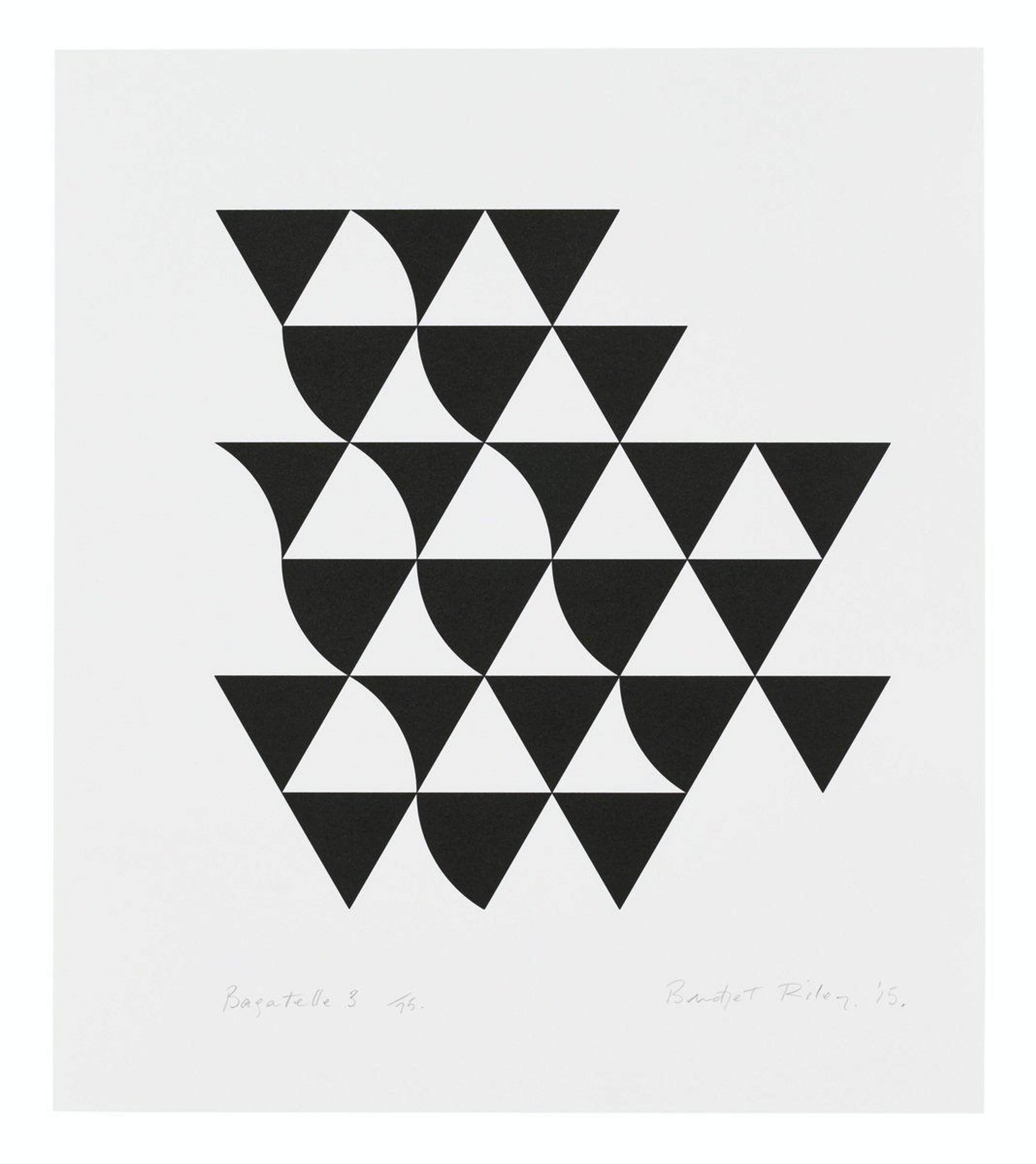
Eventually, Riley’s palette had a full circle moment with her 2015 Bagatelle series. In lieu of heer previous use of squares, lines, and dots, she embraced triangles as her primary motif. This grid of black and white triangles possessed a quality that was still quintessentially Riley, just with a fresh approach to it. Though not quite a pyramid, these stacks and rows of curved and straight triangles mirror the waves and movement seen throughout Rilley’s career. Perhaps, at this stage, she was revisiting the familiar, challenging herself to commence a new chapter that honoured her legacy while also exploring new horizons.
Bridget Riley’s Influence on Contemporary Art
Bridget Riley’s Influence on Contemporary Art
Riley’s vibrant and kinetic artworks have cast a long-lasting imprint on the landscape of modern art, notably through her meticulous exploration of colour and perceptual experiences.
Riley, through her audacious use of colour and geometric forms, has unwittingly sculpted much of the framework for modern and contemporary artists in exploring perceptual experiences. Her ability to meld colour and form into a language that transcends static representation has opened entirely new horizons, wherein artists continue to explore, challenge, and converse with viewer’s perceptual realities.
Even in her later years, Riley never stopped evolving and blending traditional and modern techniques, showcasing a never-ending curiosity in her art. Her ability to explore and redefine colour theory through precise shapes and varied colours continues to inspire and challenge perspectives in contemporary art. At 92 years of age, Riley has taken on a new challenge with her first ceiling work at the British School in Rome. Featuring her renowned stripes with a curved appearance, Riley’s infusing her popular blue shades as a supporting background to her red, white, orange, and lilac lines. Though inspired by Michelangelo's ceiling at the Sistine Chapel, this masterpiece is a true Riley original, skillfully merging the timeless allure of historic art with her own signature optical experiences. This venture not only reinforces her ceaseless spirit of innovation but also showcases an elegant binding of tradition and contemporary artistry, continually rewriting the expectations of visual storytelling.


