Letter
Paintings
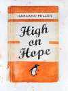
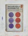
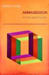
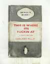
The formal qualities and overall layout of Harland Miller's Letter Paintings were inspired by hand-drawn Medieval illuminated manuscripts and the graphics of post-war psychology publications. In contrast to his Penguin series, the prints comprising this series are not centre not around whole, fictitious books, with sardonically inventive titles, but around letters, single short words, and acronyms.
Harland Miller Letter Paintings For sale
Letter Paintings Market value
Auction Results
| Artwork | Auction Date | Auction House | Return to Seller | Hammer Price | Buyer Paid |
|---|
Sell Your Art
with Us
with Us
Join Our Network of Collectors. Buy, Sell and Track Demand
Meaning & Analysis
Ace by Harland Miller is an etching with woodcut produced in 2019, making it one of Miller’s more recent artworks. The etching is based on a 2017 painting of the same name from Miller’s Letter Painting series. The print is rendered in bright and vibrant colours with blue, pink and red dominating the composition. Miller spells out the word ‘ace’ in large letters, layering the letters over one another so the shapes blur together in an abstract design. Consistent with the Pop artists who came before him, Miller abstracts and reconstitutes the meaning behind mundane mono and bisyllabic words, rendering these in bold and saturated typefaces. In doing so, Miller blurs the boundary between high and low culture, a characteristic trait of the Pop Art movement.
The formal qualities and overall layout of Ace were inspired by hand drawn Medieval illuminated manuscripts and the graphics of post-war psychology publications. Miller drew inspiration from these psychology publications in his other works such as Armageddon Is It Too Much To Ask? and Happiness.
The influence of the Pop Art movement is felt clearly in the bold colours used in the print. The kaleidoscopic layering of colour on the print resonates with prints by leading Pop Artists such as Andy Warhol. Miller has explicitly stated the influence of Warhol on his artistic career, comparing his Penguin series, in which he appropriates the dust jackets of Penguin classics and turns these everyday paperbacks into works of art, to Warhol’s Campbell’s Soup series.
Ace differs from other prints by Miller as the artist is most famous for depicting book and journal covers. As opposed to the Penguin series, the artworks comprising Miller’s Letter Painting series are not centred around titles of books that the artist has wittily created. Rather, the works draw on single short words and acronyms.
Miller’s experimentation with letters and words in the Letter Painting series harks back to his dual interests in art and literature. As well as being a renowned artist, Miller was a critically acclaimed author, having published two novels in 2000, Slow Down Arthur, Stick to Thirty and First I Was Afraid, I Was Petrified. He also carried out a Writer’s Residency at the Institute of Contemporary Art in Boston in 2002. Miller incorporates language into his art, demonstrating his multifaceted talents and wide range of interests.
