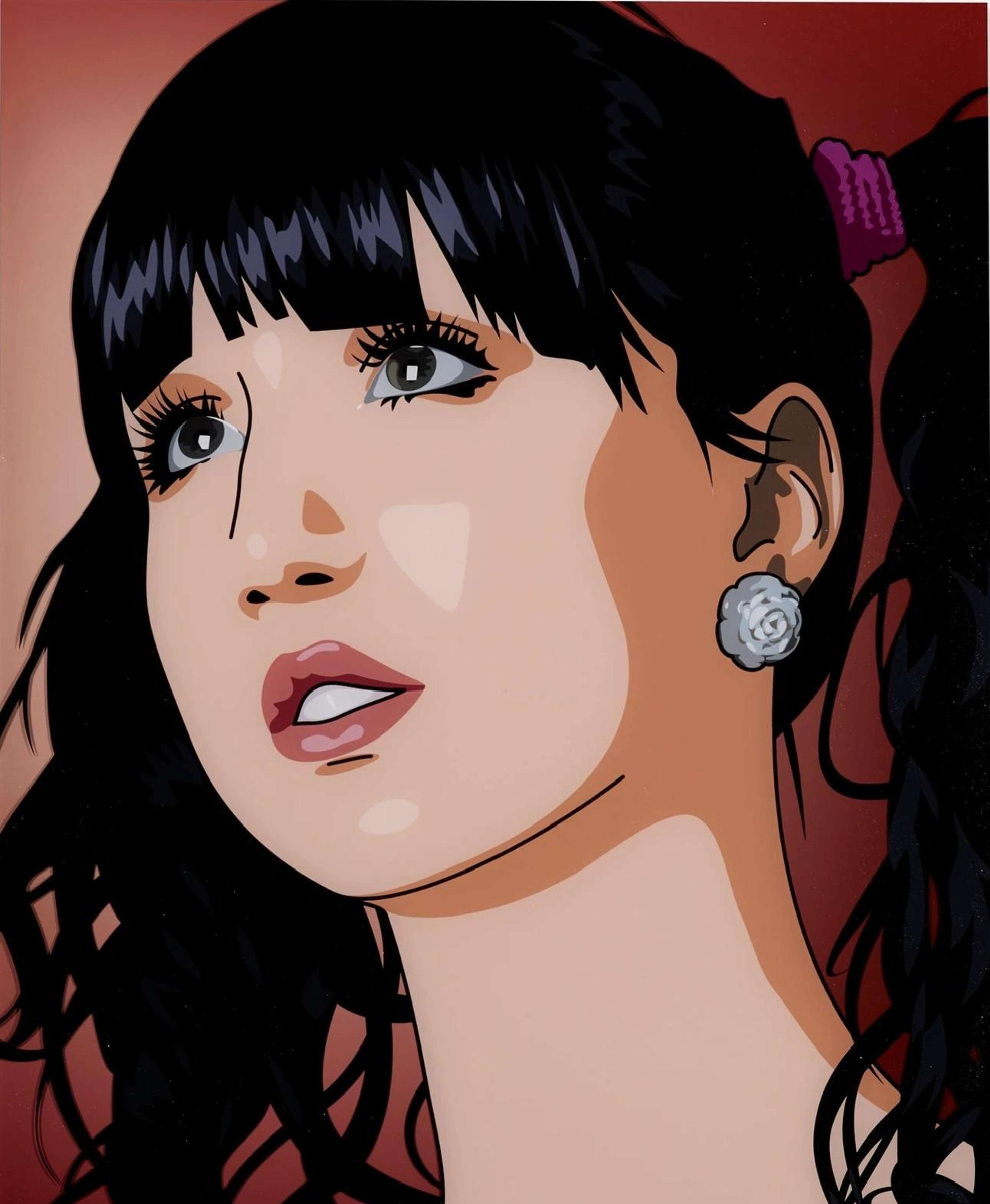
Elena And Cressie Get Ready For The Party 5
Elena And Cressie Get Ready For The Party 5
Signed Print
Julian Opie
£2,500-£3,750
$4,750-$7,000 Value Indicator
$4,650-$7,000 Value Indicator
¥23,000-¥35,000 Value Indicator
€2,900-€4,300 Value Indicator
$27,000-$40,000 Value Indicator
¥540,000-¥810,000 Value Indicator
$3,400-$5,000 Value Indicator
There aren't enough data points on this work for a comprehensive result. Please speak to a specialist by making an enquiry.
78 x 62cm, Edition of 30, Screenprint
Auction Results

Track auction value trend
Meaning & Analysis
Rendered in the artist’s late-graphic style, Elena And Cressie Get Ready For The Party 5 is a print from Julian Opie’s Elena And Cressie Get Ready For The Party series (2011). The print shows a close-up portrait of a young woman with dark hair who looks to the left of the frame into the distance. Mirroring the slick, depersonalised aesthetic of the computer-rendered image, the sitter’s gaze is distant and thus creates a sense of alienation between viewer and subject.
Elena And Cressie Get Ready For The Party 5 is depicted with a high level of detail, retaining tonal contours in the face and hair that give the print a stronger sense of depth than is usual throughout Opie’s oeuvre. At the same time, Opie uses strong graphic lines to outline the figure’s face and features that emphasises the artificiality of the image that toes the line between reality and representation.
Speaking of his development in style Opie has said, ‘The first drawings were very simple, but that gave me a language on which to build. They started as black and white, with very pared-down parameters – the mouth was just a straight line and so on – and bit by bit I adjusted it until it seemed like the right balance between someone real and this generic form.’
