Happiness
The Case Against
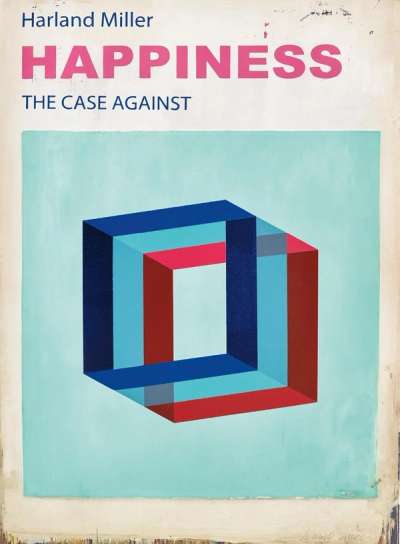
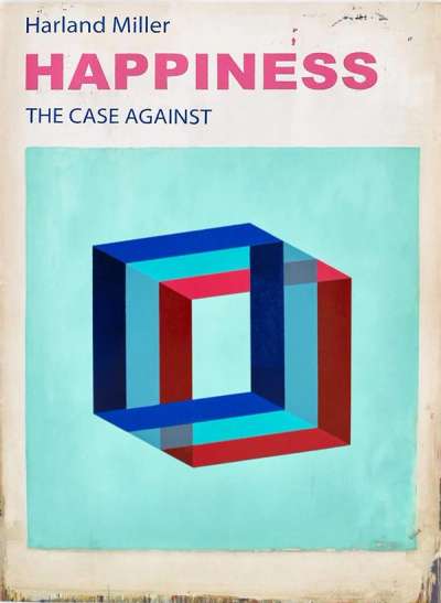
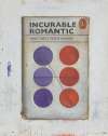
In Happiness, Harland Miller parodies self-help manuals. Against a turquoise square background, a seemingly three-dimensional cube is depicted hovering in the centre of the composition in red and blue. The manual title encapsulates Miller’s characteristic dark humour and wit, which marks many of his prints depicting book covers such as those that are part of the Penguin series.
Harland Miller Happiness The Case Against For sale
Happiness The Case Against Value (5 Years)
Harland Miller's Happiness The Case Against series has historically shown more modest results compared with the artist’s wider oeuvre, with auction prices ranging from £5000 to £10000. Average annual growth has remained modest at -1.53%, with certain works seeing declines in value. Over 11 total auction appearances, average selling prices have held steady around £7015. This series appeals to collectors seeking accessible entry points into Harland Miller’s print market.
Happiness The Case Against Market value
Auction Results
| Artwork | Auction Date | Auction House | Return to Seller | Hammer Price | Buyer Paid |
|---|---|---|---|---|---|
 Happiness (large) Harland Miller Signed Print | 24 Jan 2026 | Phillips London | £5,525 | £6,500 | £9,000 |
 Happiness (small) Harland Miller Signed Print | 26 Sept 2024 | Bonhams New Bond Street | £4,250 | £5,000 | £6,500 |
Sell Your Art
with Us
with Us
Join Our Network of Collectors. Buy, Sell and Track Demand
Meaning & Analysis
Branching out into Penguins’ Pelican collection, Happiness the case against (2017) sees Miller re-appropriate a more graphic cover here. The print is reflective of Miller’s fascination with book covers and literature, yet here, as opposed to the Penguin series, this Harland Miller print turns our attention to psychology and social science publications from the 1960s and 1970s.
In Happiness, Miller depicts the cover design of a self-help manual where a three-dimensional red and blue cube hovers in the centre of the composition. Above the image, the title is written in pin capitalised letters, beneath which Miller adds The Case Against, in dark blue lettering.
The print exemplifies Miller’s technical aptitude for printing, as he utilises various techniques, such as polymer-gravure, photo-etching and block printing to achieve a more graphic and superimposed finish. The effect of these various techniques is that while at first glance the work seems one dimensional, its main elements have in fact been given a multi-layered appearance.
