Love
Find out more about the Love collection, browse prints & editions for sale & view the works wanted by active buyers right now.
Robert Indiana Love For sale
Sell Your Art
with Us
with Us
Join Our Network of Collectors. Buy, Sell and Track Demand
Meaning & Analysis
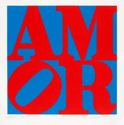
Easily Indiana’s most recognisable piece, LOVE has been repeatedly revisited by the artist over the years, with the image taking the form of paintings, sculptures and prints. The work originates in poems written by Indiana in the 60s, but was launched into worldwide recognition when the Museum of Modern Art selected the original painting to feature on its Christmas card in 1965. It became the most popular Christmas card the museum has ever released. In 2022, in the first major UK retrospective of Indiana’s work, Yorkshire Sculpture Park exhibits a LOVE sculpture in red, blue and green which greets visitors at the museum’s entrance.
Through to the present day, the image is strongly associated with the “Love Generation” and 60s hippy culture, even if these powerful socio-cultural links were not elemental to the image’s genesis. In the words of the artist himself: “oddly enough, I wasn’t thinking at all about anticipating the love generation and hippies. It was a spiritual concept. It isn’t a sculpture of love any longer. It’s become the very theme of love itself.”
Not all of the uses of the image have come with the artist’s seal of approval. Bradford R Collins notes that the image “by some estimations, became America’s most plagiarised work of art. Produced before the stricter copyright law of 1978, it was appropriated by an endless number of commercial designers for everything from clothes to book covers.”
The red, green and blue of the original painting were said by the artist to be inspired by the colours of a gas station where his father worked when Indiana was a child, but are also often linked to the hard-edged fields of colour in “Red Blue Green” by Ellsworth Kelly, Indiana’s former partner. The motif appears in a range of colour palettes across this grouping of prints, from the subdued hues of Love (greys) to the vivid tones of The Book Of Love (yellow, red and blue).
The capital letters are rendered in a serif typeface, with the L & O stacked upon on the V & E. The tilted O has the result of a satisfyingly balanced where the letters evenly occupy their respective quadrants. In the artist’s own words: “The word LOVE got to be the way it is because I have a kind of a passion about symmetry and the dividing of things into equal parts. The word LOVE is that way because those four letters best fit a square if the square is squared by that particular arrangement. And it was really that sort of a necessity for a very compact form that I came upon that arrangement.“
Indiana was not entirely comfortable with the image’s popularity, fearing that it would cause him to fall out of favour with the buyers of his work. Despite his complex feelings towards LOVE’s success, he would revisit the image multiple times during his career. In this grouping, we can see many versions of the image in different colour schemes, many of which are themed, including German Love, Greenpeace Love and Swedish Love. Other variations of the image include Black And White Love, which sees the text repeated in four quadrants, each rotated at a 90 degree angle.


